Data visualization#
Echopype provides a way to quickly plot your data that has been converted with open_raw, or preprocessed as either Sv or MVBS. The visualize module in echopype will need the optional plot packages to be installed within your python environment. In order to do this, you need to specify [plot] during the installation of echopype.
pip install echopype[plot]
This installation includes matplotlib and cmocean libraries for plotting and providing you with a custom EK500 colormap along with all the wonderful colormap that cmocean provides.

Fig. 1 Comparison of Jet and EK500 colormap. You can see the zooplankton within the echogram better with the EK500.#
The visualize module#
To start utilizing the visualization module you can import the module by importing echopype.visualize.
import echopype.visualize as epviz
The visualize module contains a single useful function called create_echogram.
create_echogram can take both echodata or xarray dataset objects, and contains many other inputs to plot certain frequencies,
auto compute range, and add water level.
Visualization demo#
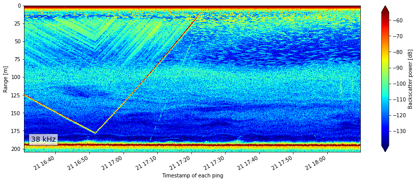
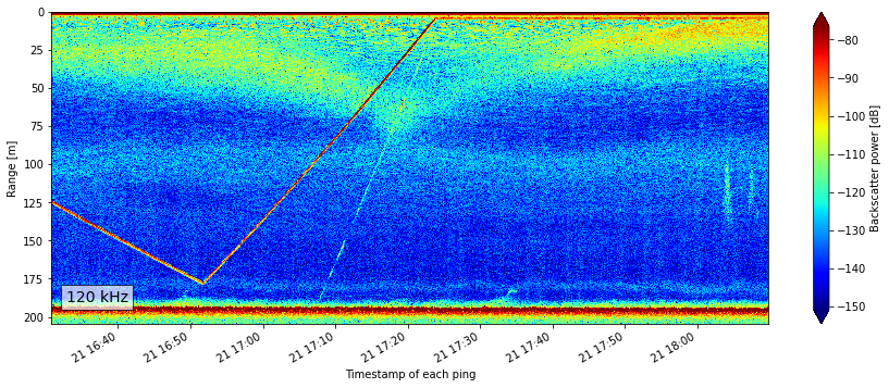
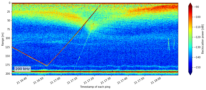
Below is an example of quick plotting for one of the OOI raw dataset used in the Moored Echosounder Example notebook.
import matplotlib.pyplot as plt

import echopype.visualize as epviz
import echopype as ep

raw_url ="https://rawdata.oceanobservatories.org/files/CE04OSPS/PC01B/ZPLSCB102_10.33.10.143/2017/08/21/OOI-D20170821-T163049.raw"
echodata = ep.open_raw(raw_file=raw_url, sonar_model="EK60")
09:43:28 parsing file OOI-D20170821-T163049.raw, time of first ping: 2017-Aug-21 16:30:49
# Quickly look at all of the frequency,
# calculate range on the fly,
# and color the data based on the actual data range available.
epviz.create_echogram(echodata, get_range=True, robust=True)
[<xarray.plot.facetgrid.FacetGrid at 0x7f0b4f32ffd0>,
 <xarray.plot.facetgrid.FacetGrid at 0x7f0b4f44efa0>,
 <xarray.plot.facetgrid.FacetGrid at 0x7f0b4f321ac0>]


From a quick look at the plot we can quickly tell that this is upside down, and therefore the data need to be flipped since this is coming from an echosounder that is upside down on a platform around 200m depth. For the purpose of this demo, we are not going to do that flipping. See the Moored Echosounder Example notebook for more detail on this dataset.
